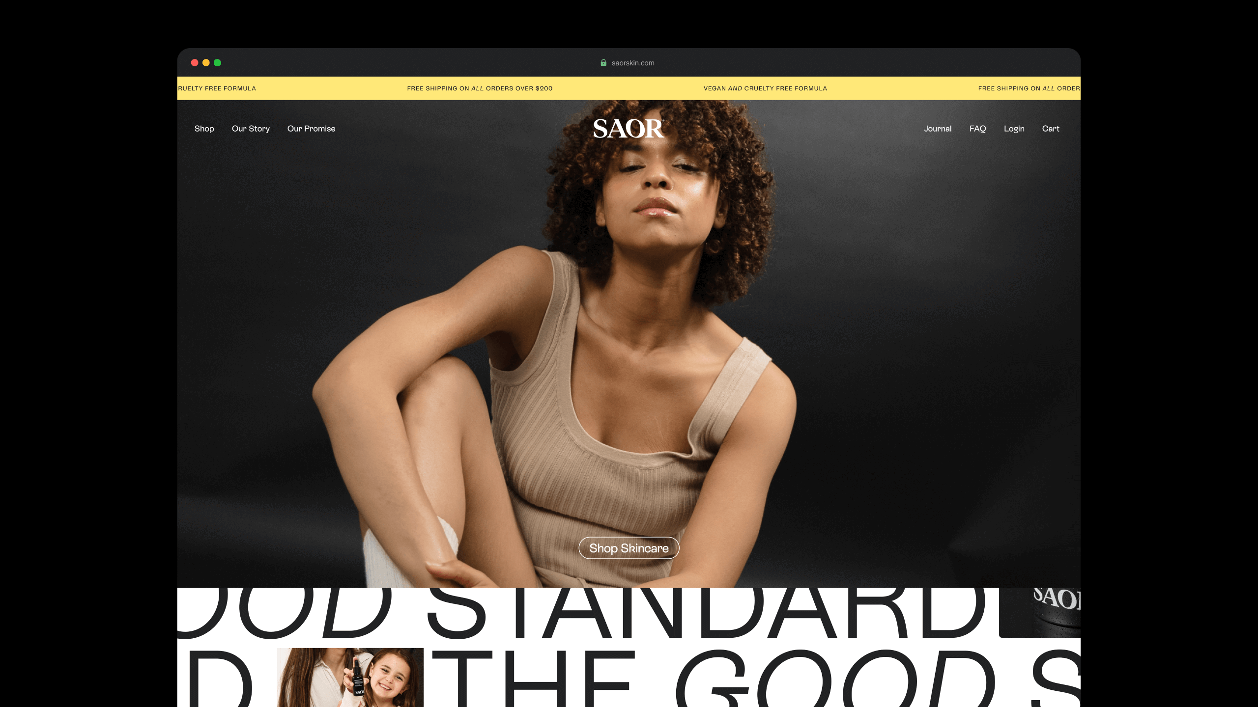
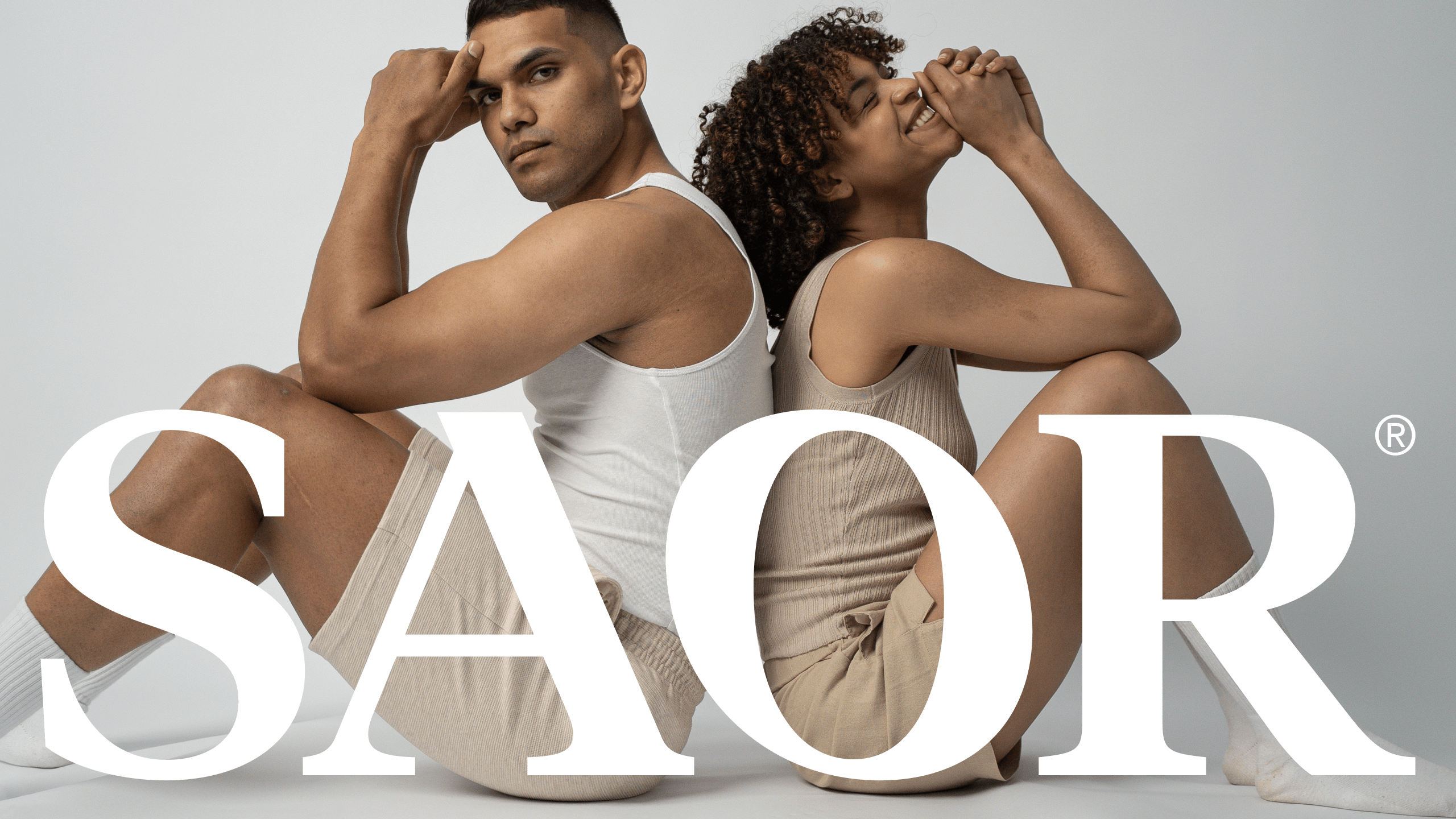
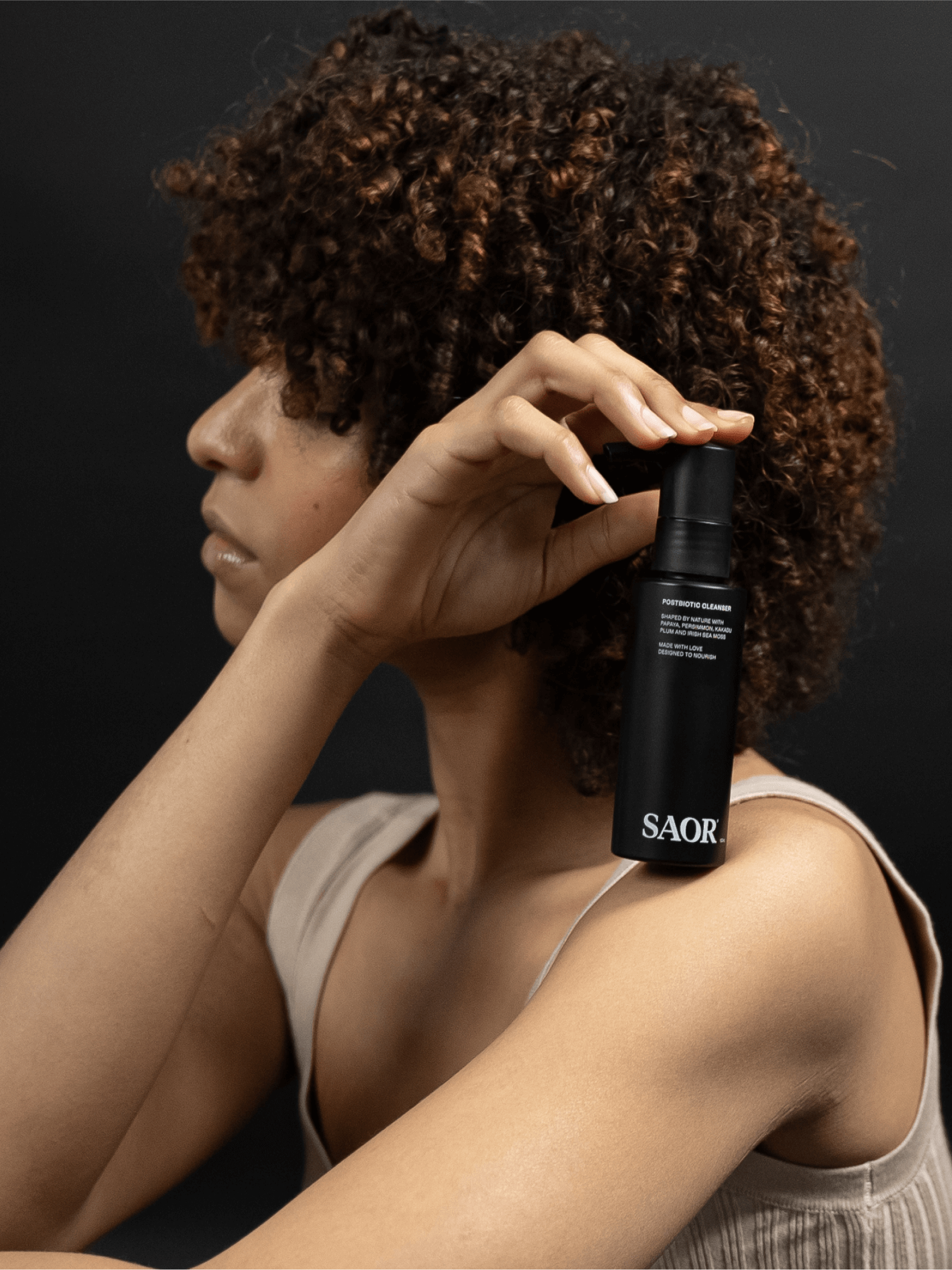
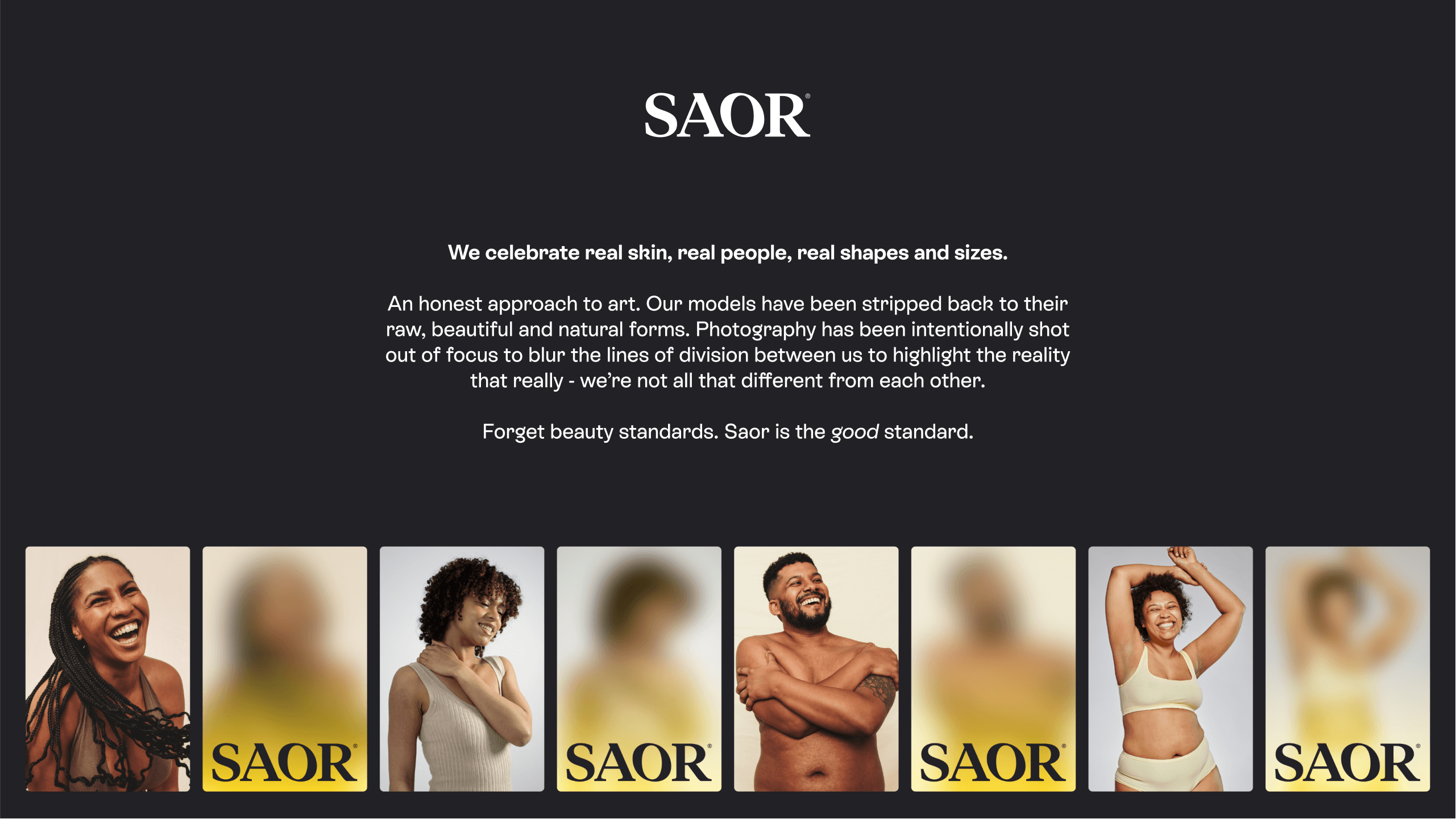
Saor Skin is a skincare brand built on a mission that goes beyond the product: helping people fall more in love with themselves, feel more in tune with their mind, and get a hell of a lot more comfortable in their own skin, regardless of the colour of it.
Where most beauty brands sell an external standard to chase, Saor redefines what beauty means altogether, treating skincare as one part of a bigger psychological and emotional wellness journey rather than the whole story. It’s for people who want products that support self-acceptance, not products that imply they need fixing first.
The brand speaks with confidence and conviction, clear and intentional about its values rather than chasing trends, backed by a tagline that says exactly what it stands for.
- Region
- Sydney
- Year
- 2022