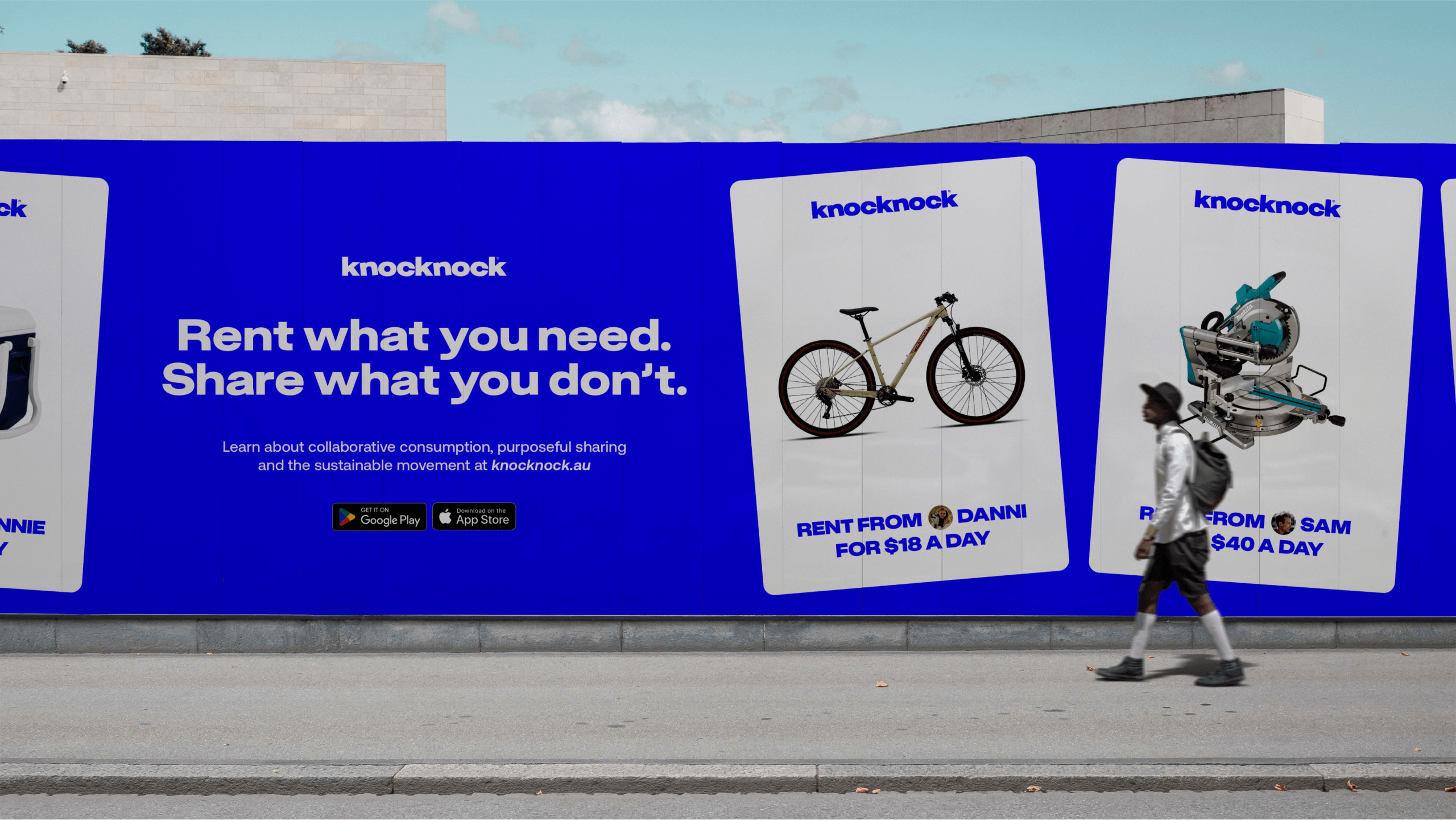
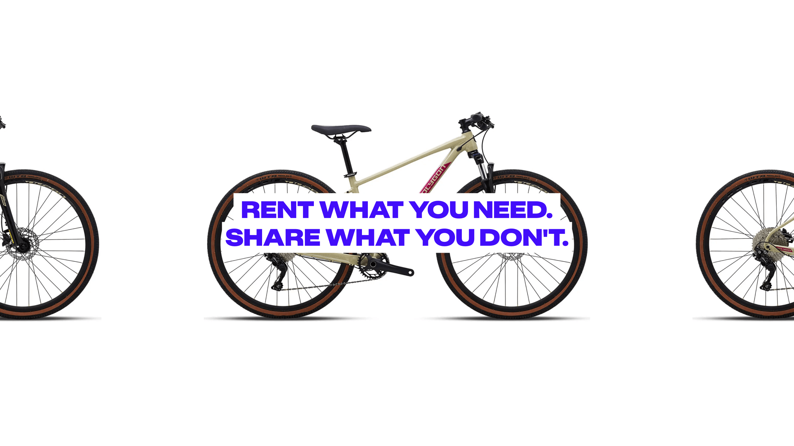
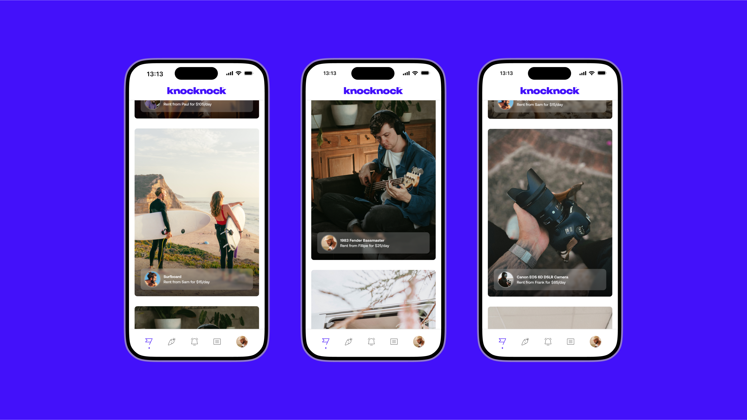
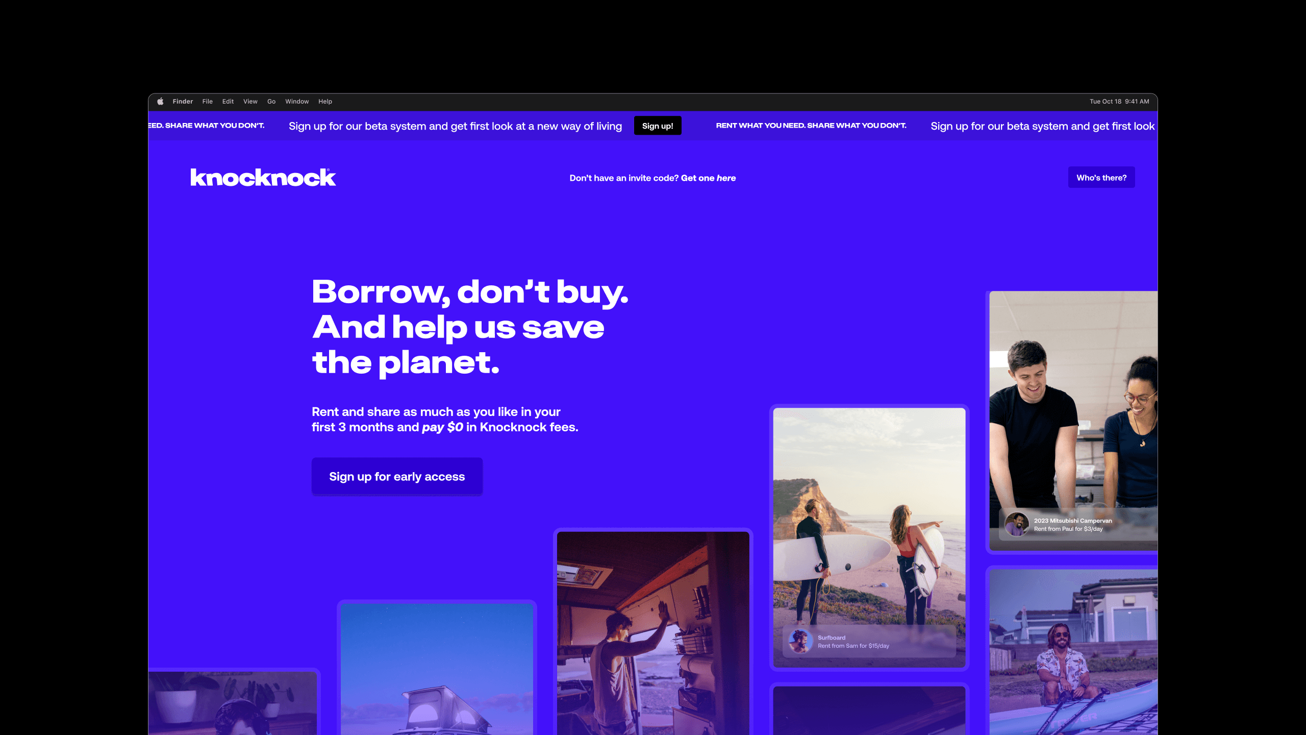
Knocknock is a communal ownership platform built around a simple idea: rent what you need, share what you don’t. Instead of everyone buying, storing, and eventually discarding the same rarely used items, Knocknock lets people access what they need when they need it, and put their own underused possessions to work for others.
The result is less stuff, less clutter, and more financial freedom to spend on the things people actually love, not the things sitting in a garage. It’s a practical alternative to ownership for cost-conscious, sustainability-minded consumers who’d rather borrow well than buy and forget.
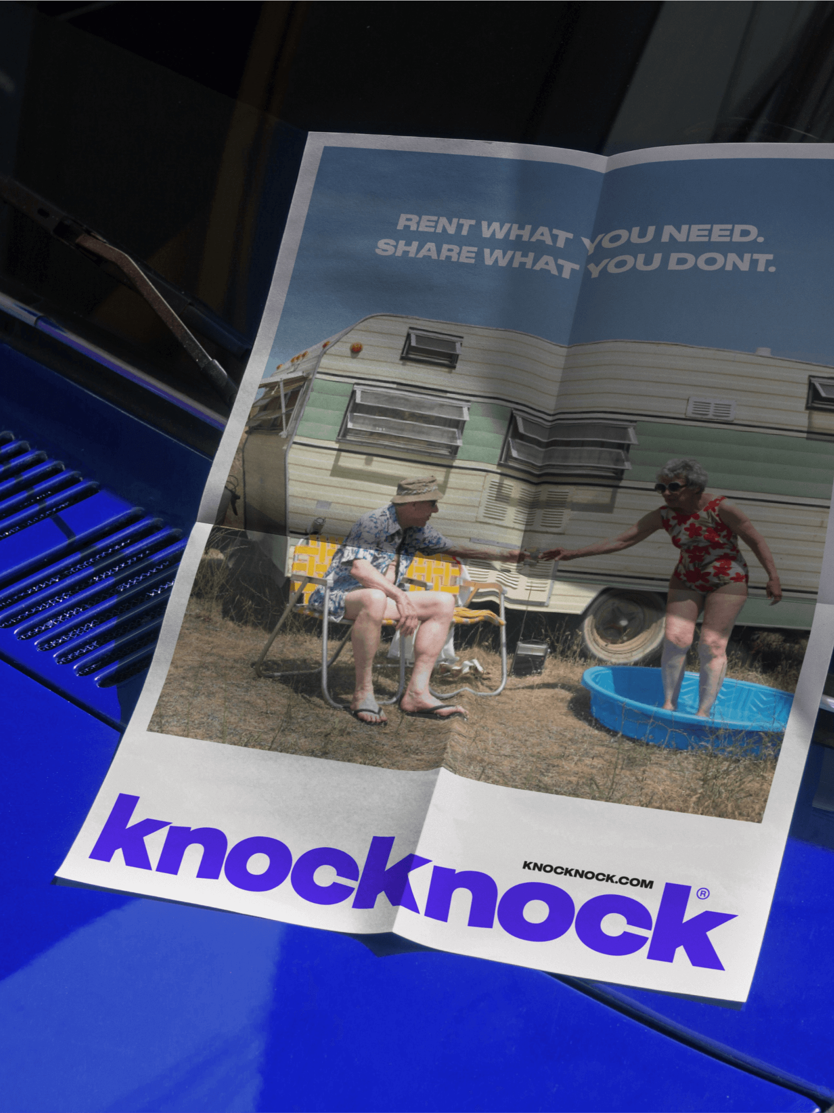
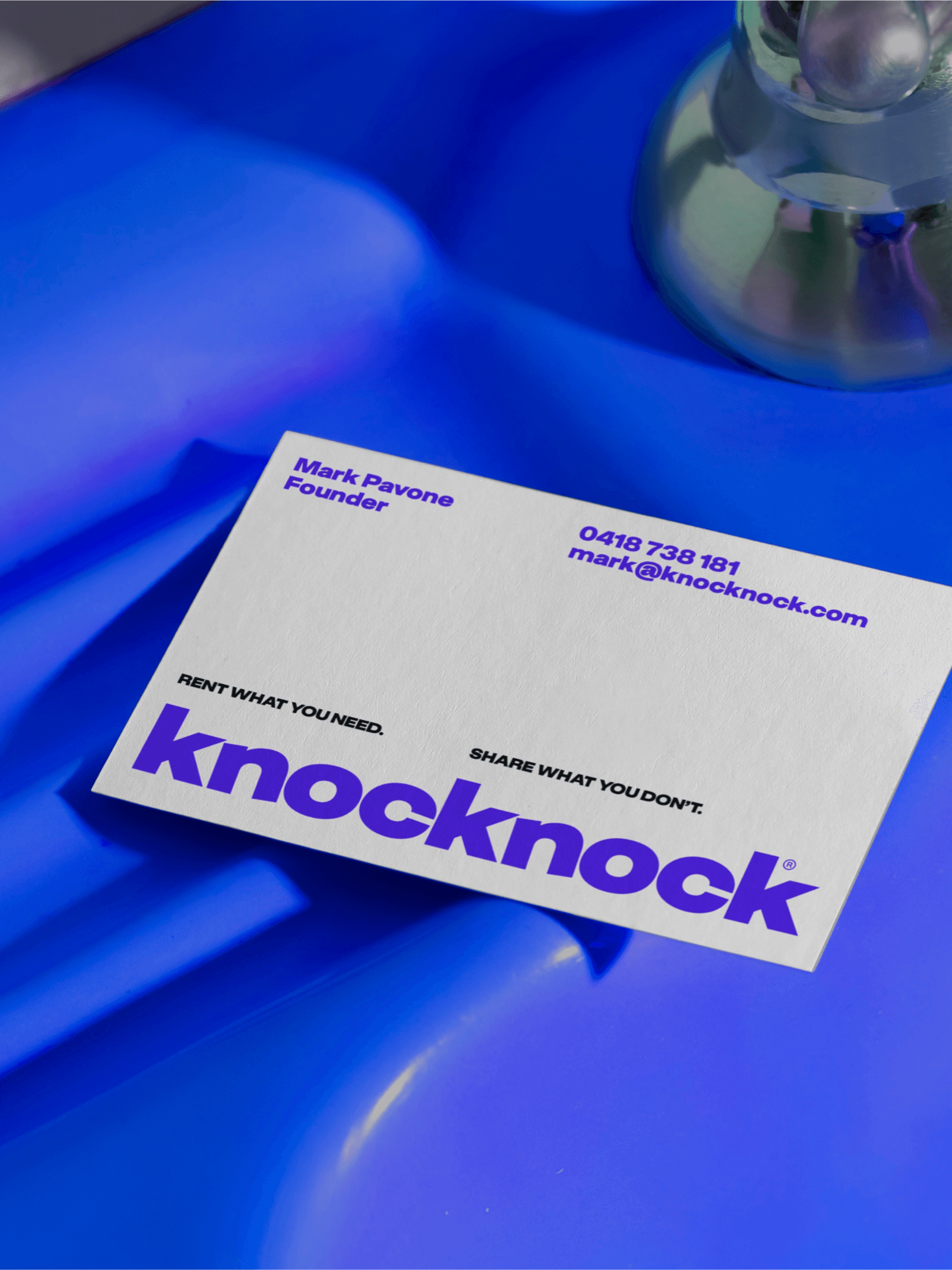
The brand carries that intentionality through everything it touches: a sophisticated, thoughtful identity built to hold up consistently across campaign, product, and everyday use, not just look good in a deck.
- Year
- 2024