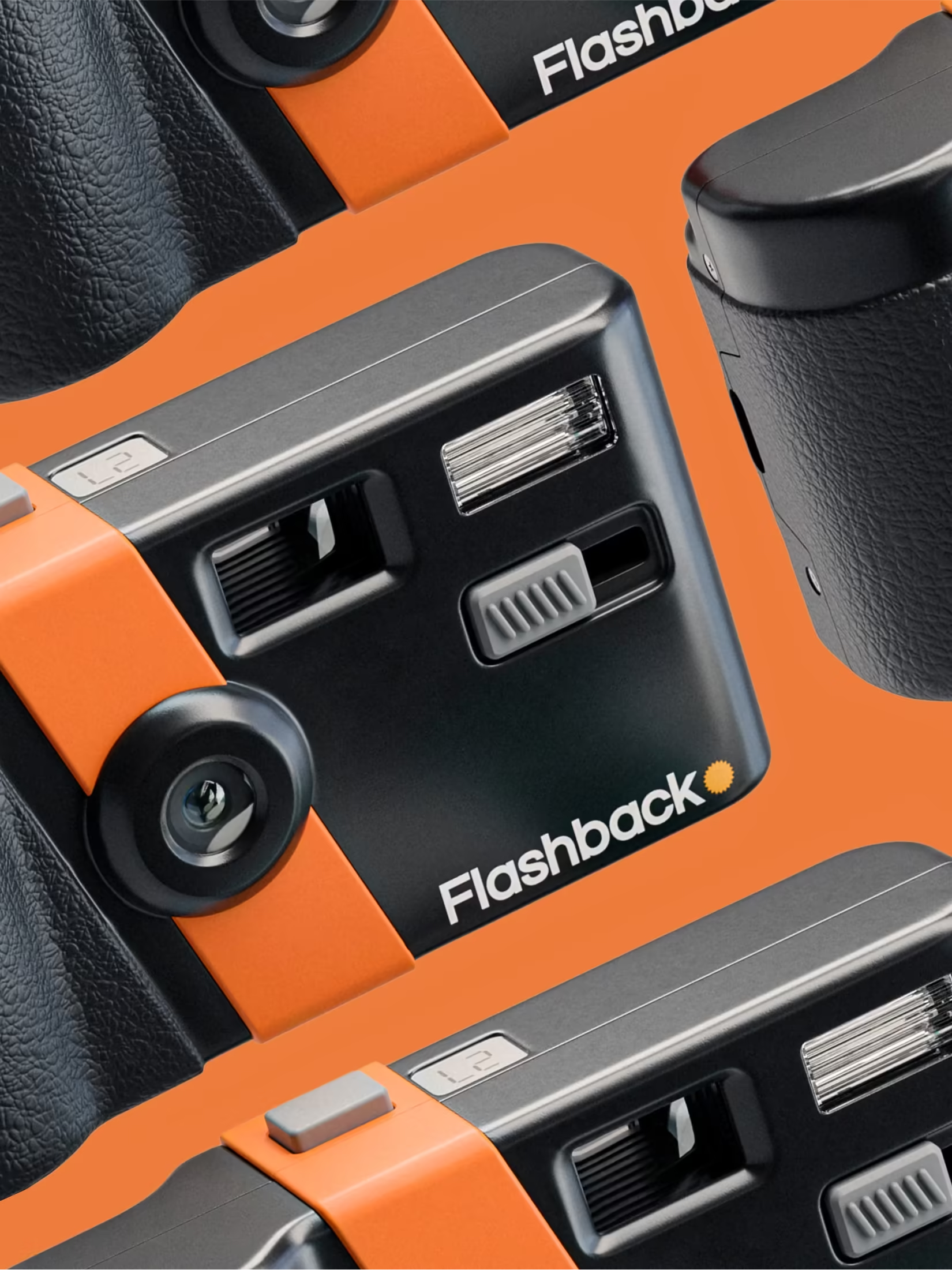
Flashback set out to bring romance and nostalgia back to everyday photography. The product feels like a disposable camera (in the way it shoots, handles, and surprises you) but it is digital, reusable, and better for the planet.
That tension (familiar yet new, nostalgic yet forward) is exactly the kind of challenge brand development exists to solve.
The brand challenge
Flashback needed an identity that communicated warmth and spontaneity without feeling retro for retro’s sake. The brand had to attract a generation that never used film but craves the feeling of it.
Strategy before aesthetics
We started with positioning: Flashback is not a camera company. It is a feeling company. The product is a delivery mechanism for a specific emotional experience, anticipation, surprise, imperfection as charm.
That strategic frame shaped every identity decision, colour, typography, packaging, and the language around the brand.
Identity that captures a feeling
The visual identity needed to feel tactile and human in a category dominated by sleek tech minimalism. We built a system that could live across product, app, social, and retail, always evoking the same emotional territory.
Why product brands need brand development
Hardware and app brands often launch with a logo and a hope. The ones that endure invest in the full system (strategy, naming, identity, and design application) so every touchpoint reinforces the same story.
At Maker Street Studios, we work with product founders from pre-seed through scale, building brands that carry from Kickstarter to category leader.
To discuss strategy, identity, or a full brand development engagement, start a conversation with our studio.